Components
Breadcrumbs _breadcrumbs.scss
Breadcrumbs are used to provide signposting of a users location and to enable quick navigation around the site. They are only to be used as a secondary means of navigation however. Pages should also be navigable through other means.
Example
- uSwitch.com
- Credit report
- Credit reports guides
- Statutory credit reports
               <ul class="us-crumbs">
                 <li class="us-crumbs__item"><a href="/" class="us-crumbs__link">uSwitch.com</a></li>
                 <li class="us-crumbs__item"><a class="us-crumbs__link" href="http://www.uswitch.com/credit-reports/">Credit report</a></li>
                 <li class="us-crumbs__item"><a class="us-crumbs__link" href="http://www.uswitch.com/credit-reports/guides/">Credit reports guides</a></li>
                 <li class="us-crumbs__item">Statutory credit reports</li>
               </ul>
Buttons _button.scss
Our buttons used across the site. The states give different use cases. Both <a> and <button> tags are supported. Please use role='button' when using an <a> tag.
States
- .us-btn--primary - Used as a save/update button.
- .us-btn--action - Navigational button.
- .us-btn--secondary - Secondary.
- .us-btn--hero - Navy outline used for buttons on hero banners.
- .us-btn--reversed - White outline for dark backgrounds.
- .us-btn--large - Larger button for heros.
- .us-btn--small - Smaller button for mobile tables.
- .us-btn--blocked - Full width button.
- .us-btn--link - link style button.
- .us-btn--stronger - Emphasis button.
- .us-btn--disabled - Disabled styling (can also be styled with :disabled).
- .us-btn--secondary--disabled - Disabled styling (can also be styled with :disabled).
Example
              <a href="#" class="us-btn" role="button">Link Button</a>
              <button class="us-btn">Button Element</button>
Calculator _calculator.scss
The calculator tends to sit in the table toolbar component and is used to refine results from comparison tables, and give estimated info about products based on the input.
Example
               <form class='us-calculator'>
                 <h2 class='us-table-toolbar__heading'>How much would you like to transfer?</h2>
                 <div class='us-calculator__input us-input-group'>
                   <div class='us-input-group__box'>£</div>
                   <input type='text' class='us-form-input' pattern='[0-9]*' name='amount' id='amount' value='3000' />
                 </div>
                 <button class='us-calculator__btn us-btn us-btn--primary'>Update results</button>
                 <div class='us-tooltip us-tooltip--right'>
                   <div class='us-tooltip__wrapper'>
                     <div class='us-tooltip__icon'></div>
                     <div class='us-tooltip__note'>
                       <div class='us-tooltip__arrow'></div>
                       Note that this is illustrative and this figure does not reflect the credit limit you will be offered.
                     </div>
                   </div>
                 </div>
               </form>
Comp table row _comp-table-row.scss
The .us-ct__row appears in the comparison tables, and contains a single product.
States
- .us-ct-row--details-toggle - Used for a thicker bottom border when the toggle is showing.
Example
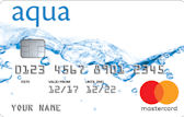
aqua Reward With Cashback
- £20 Amazon gift certificate exclusively through uSwitch (terms apply)
- 0.5% cashback and no foreign transaction fees
- Credit limit increase possible after four months
- be 18 or older
- have a permanent UK address
- have a UK current bank or building society account
- not be registered bankrupt in past 18 months or have proceedings
- have no CCJs (past 12 months)
Additional criteria for acceptance from the lender may apply.
               <div class="us-ct-row">
                 <div class="us-ct-row__title">
                   <p class="us-ct-row__title-text">aqua Reward With Cashback</p>
                   <div class="us-usp us-usp--orange">£20 Amazon voucher</div>
                   <div class="us-usp us-usp--green">Cashback</div>
                 </div>
                 <div class="us-ct-row__product">
                   <div class="us-ct-row__col us-ct-row__col--image">
                     <img src="https://uswitch-cms.imgix.net/uswitch-assets-eu/banking/credit-cards/cards/aqua-2017-large.png?w=170&h=107&fit=auto&bg=0fff&fm=png8" class="us-ct-row__image" />
                     <div class="us-ct-row__title--mobile"><strong>aqua Reward With Cashback</strong></div>
                     <div class="us-ct-row__usp--mobile">
                       <div class="us-usp us-usp--orange">£20 Amazon voucher</div>
                       <div class="us-usp us-usp--green">Cashback</div>
                     </div>
                   </div>
                   <div class="us-ct-row__col us-ct-row__col--stretch">
                     <div class="us-ct-row__name"><strong>34.9% APR</strong></div><div class="us-ct-row__value">Representative (variable)</div>
                   </div>
                   <div class="us-ct-row__col us-ct-row__col--stretch">
                     <div class="us-ct-row__name"><strong>£250</strong></div><div class="us-ct-row__value">Minimum credit limit</div>
                   </div>
                   <div class="us-ct-row__col us-ct-row__col--stretch">
                     <div class="us-ct-row__name"><strong>£1250</strong></div><div class="us-ct-row__value">Maximum credit limit</div>
                   </div>
                   <div class="us-ct-row__col us-ct-row__col--apply">
                     <a class="us-btn us-btn--primary us-btn--blocked" href="#" role="button">Apply</a>
                     <a href="#" class="us-ct-row__more-info">More info</a>
                   </div>
                 </div>
                 <span class="us-ct-row__rep-ex">Representative example: When you spend £1,200 at a rate of 34.91% (variable) per annum, your representative APR is 34.9% APR (variable)</span>
                 <div class="us-ct-row__key-details">
                   <button class="us-ct-row__key-details-toggle us-ct-row__key-details-toggle-open">View key details <svg role="presentation" class="us-ct-row__key-details-chevron"><use xlink:href="/images/icons.svg#icon-chevron-right"></use></svg></button>
                   <div class="us-ct-row__key-details-info">
                     <div class="us-ct-row__key-details-col">
                       <strong>Card details</strong>
                       <ul class="us-ct-row__key-details-ul">
                         <li>£20 Amazon gift certificate exclusively through uSwitch (terms apply)</li>
                         <li>0.5% cashback and no foreign transaction fees</li>
                         <li>Credit limit increase possible after four months</li>
                       </ul>
                     </div>
                     <div class="us-ct-row__key-details-col">
                       <strong>To get this card you must at least:</strong>
                       <ul class="us-ct-row__criteria us-ct-row__key-details-ul">
                         <li class="us-ct-row__criteria-li"><svg role="presentation" class="us-icon us-icon--small us-icon--tick us-ct-row__criteria-tick"><use xlink:href="/images/icons.svg#icon-tick"></use></svg>be 18 or older</li>
                         <li class="us-ct-row__criteria-li"><svg role="presentation" class="us-icon us-icon--small us-icon--tick us-ct-row__criteria-tick"><use xlink:href="/images/icons.svg#icon-tick"></use></svg>have a permanent UK address</li>
                         <li class="us-ct-row__criteria-li"><svg role="presentation" class="us-icon us-icon--small us-icon--tick us-ct-row__criteria-tick"><use xlink:href="/images/icons.svg#icon-tick"></use></svg>have a UK current bank or building society account</li>
                         <li class="us-ct-row__criteria-li"><svg role="presentation" class="us-icon us-icon--small us-icon--tick us-ct-row__criteria-tick"><use xlink:href="/images/icons.svg#icon-tick"></use></svg>not be registered bankrupt in past 18 months or have proceedings</li>
                         <li class="us-ct-row__criteria-li"><svg role="presentation" class="us-icon us-icon--small us-icon--tick us-ct-row__criteria-tick"><use xlink:href="/images/icons.svg#icon-tick"></use></svg>have no CCJs (past 12 months)</li>
                       </ul>
                       <p class="us-ct-row__criteria-additional">Additional criteria for acceptance from the lender may apply.</p>
                     </div>
                   </div>
                 </div>
               </div>
Compliance banner _compliance-banner.scss
Compliance banner and disclaimer below the comparison table
Example
             <div class="us-comp-banner">
               <div class="us-comp-banner__inner">
                 <p class="us-comp-banner__text">uSwitch Limited is a credit broker, not a lender, for consumer credit products.</p>
                 <p class="us-comp-banner__text">uSwitch services are provided at no cost to you, but we may receive a commission from the companies we refer you to.</p>
               </div>
             </div>
Content group _content-group.scss
The .us-content-group is a separator element for content groupings. Ideal to split up landing pages with reasonable padding.
States
- .mobile-bordered - Adds a smaller border and padding to mobile devices.
Example
Swat at dog intrigued by the shower missing until dinner time and run in circles use lap as chair.
Swat at dog intrigued by the shower missing until dinner time and run in circles use lap as chair.
              <div class='us-content-group'>
                <p>
                  Swat at dog intrigued by the shower missing until dinner time and run in circles use lap as chair.
                </p>
              </div>
CTAs _cta.scss
Used within guide and news articles, these CTAs (Calls to Action) are intended to not interupt the content but to integrate in more subtle means.
Example
              <section class="us-cta cta cta-column">
                <form>
                  <h3 class="us-cta__title">It's your report</h3>
                  <p>Join the campaign to fight for free annual credit reports for everyone</p>
                  <a href="/money/itsmyreport/" class="us-btn us-btn--primary" rel="nofollow">Sign the petition</a>
                </form>
              </section>
Hero _hero.scss
The .us-hero is used for the upper part of most pages, where the calls to action are usually kept.
It is intended to draw attention with $c-cyan as it's background color, and should be used across all landing pages.
Example
Hero title
Swat at dog intrigued by the shower missing until dinner time.
Hero title
Swat at dog intrigued by the shower missing until dinner time.
               <div class='us-hero'>
                 <div class='us-hero-container'>
                   <h1 class='us-hero-title'>Hero title</h1>
                   <p class='us-hero-description us-standfirst us-mobile--hidden'>Swat at dog intrigued by the shower missing until dinner time.</p>
                 </div>
               </div>
               <div class='us-hero us-hero--double'>
                 <div class='us-hero-container'>
                   <div class="us-hero__block">
                     <h1 class='us-hero-title'>Hero title</h1>
                     <p class='us-hero-description us-standfirst us-mobile--hidden'>Swat at dog intrigued by the shower missing until dinner time.</p>
                   </div>
                   <div class="us-hero__block"></div>
                 </div>
               </div>
Anchor links _links.scss
Anchor tag styling, with and without a border.
States
- .us-link - Adds a border bottom to the link.
- .us-link--light - Changes the link colours to white for when links are placed on dark backgrounds.
Link lists _lists.scss
The default list styling for lists that have anchors to take you to other pages.
Example
               <ul class='us-list'>
                 <li><a href="#">List item 1</a></li>
                 <li><a href="#">List item 2</a></li>
                 <li><a href="#">List item 3</a></li>
               </ul>
Loader _loader.scss
Loader component to be added to any AJAX/filter loads across uSwitch. We use them specifically in tables when loading new rows.
.us-loader--loading will initiate the animation and .us-loader--centered will vertically center the loading SVG.
Example
               <div class='us-loader__container'>
                 <div class='us-loader us-loader--loading us-loader--centered'>
                   <div class='us-loader__inner'>
                     <div class='us-loader__spinner'></div>
                     <div class='us-loader__text'>
                       Loading deals
                     </div>
                   </div>
                   <div class='us-loader__overlay'></div>
                 </div>
                 <!-- EXAMPLE CONTENT -->
                 <ul class='us-list'>
                   <li><a href="#">List item 1</a></li>
                   <li><a href="#">List item 2</a></li>
                   <li><a href="#">List item 3</a></li>
                   <li><a href="#">List item 4</a></li>
                 </ul>
                 <!-- END EXAMPLE -->
               </div>
Promo banner _promo-banner.scss
Promotional banner
Example
             <div class="us-promo-banner">
               <div class="us-promo-banner__inner">
                 <h3 class="us-promo-banner__title">Title block here</h3>
                 <ul class="us-promo-banner__list">
                   <li class="us-promo-banner__list-item">
                     <span class="us-promo-banner__circle">1</span>
                     <span class="us-promo-banner__text">Text here</span>
                   </li>
                   <li class="us-promo-banner__list-item">
                     <span class="us-promo-banner__circle">2</span>
                     <span class="us-promo-banner__text">Text here</span>
                   </li>
                   <li class="us-promo-banner__list-item">
                     <span class="us-promo-banner__circle">3</span>
                     <span class="us-promo-banner__text">Text here</span>
                   </li>
                 </ul>
                 <div class="us-promo-banner__button"><a class="us-btn us-btn--action us-btn--large" href="#">Promo CTA text</a></div>
               </div>
             </div>
Reminder _reminder.scss
Placed underneath some tables to enable reminders
Example
Create a reminder and we'll let you know when you're nearing the end of your 0% period
Create a reminderCreate a reminder and we'll let you know when you're nearing the end of your 0% period
Create a reminderCreate a reminder and we'll let you know when you're nearing the end of your 0% period
Create a reminder
               <div class="us-container us-reminder">
                 <div class="us-grid-row us-reminder-title">Got a balance transfer card?</div>
                 <div class="us-grid-row us-reminder-content">
                   <p>Create a reminder and we'll let you know when you're nearing the end of your 0% period</p>
                   <a class="us-btn us-btn--primary" data-widget-creative="banner" data-widget-name="reminder-credit-cards" data-widget-position="table" data-event="" data-event-category="reminders" data-event-action="banner-click" data-event-label="credit-cards" href="/account/signin?origin=https://www.uswitch.com/account/reminders#credit-cards&source=credit-cards.reminders" data-overlay-title="Sign up to create a reminder" data-source="credit-cards.reminders" data-origin="https://www.uswitch.com/account/reminders#credit-cards" onclick="uSwitch.openSignin(event)">
                    Create a reminder
                   </a>
                 </div>
               </div>
               <div class="us-container us-reminder--grey">
                 <div class="us-grid-row us-reminder-title">Got a balance transfer card?</div>
                 <div class="us-grid-row us-reminder-content">
                   <p>Create a reminder and we'll let you know when you're nearing the end of your 0% period</p>
                   <a class="us-btn us-btn--primary" data-widget-creative="banner" data-widget-name="reminder-credit-cards" data-widget-position="table" data-event="" data-event-category="reminders" data-event-action="banner-click" data-event-label="credit-cards" href="/account/signin?origin=https://www.uswitch.com/account/reminders#credit-cards&source=credit-cards.reminders" data-overlay-title="Sign up to create a reminder" data-source="credit-cards.reminders" data-origin="https://www.uswitch.com/account/reminders#credit-cards" onclick="uSwitch.openSignin(event)">
                    Create a reminder
                   </a>
                 </div>
               </div>
               <div class="us-container us-reminder--navy">
                 <div class="us-grid-row us-reminder-title">Got a balance transfer card?</div>
                 <div class="us-grid-row us-reminder-content">
                   <p>Create a reminder and we'll let you know when you're nearing the end of your 0% period</p>
                   <a class="us-btn us-btn--action" data-widget-creative="banner" data-widget-name="reminder-credit-cards" data-widget-position="table" data-event="" data-event-category="reminders" data-event-action="banner-click" data-event-label="credit-cards" href="/account/signin?origin=https://www.uswitch.com/account/reminders#credit-cards&source=credit-cards.reminders" data-overlay-title="Sign up to create a reminder" data-source="credit-cards.reminders" data-origin="https://www.uswitch.com/account/reminders#credit-cards" onclick="uSwitch.openSignin(event)">
                    Create a reminder
                   </a>
                 </div>
               </div>
Table toolbar _table-toolbar.scss
The table toolbar sits above comparison tables and holds search refinement and filtering tools.
Example
               <div class="us-table-toolbar">
                 <div class="us-table-toolbar__wrapper">
               <form class='us-calculator'>
                 <h2 class='us-table-toolbar__heading'>How much would you like to transfer?</h2>
                 <div class='us-input-group us-calculator__input'>
                   <div class='us-input-group__box'>£</div>
                   <input type='text' class='us-form-input' pattern='[0-9]*' name='amount' id='amount' value='3000' />
                 </div>
                 <button class='us-btn us-btn--primary'>Update results</button>
                 <div class='us-tooltip us-tooltip--right'>
                   <div class='us-tooltip__wrapper'>
                     <div class='us-tooltip__icon'></div>
                     <div class='us-tooltip__note'>
                       <div class='us-tooltip__arrow'></div>
                       Note that this is illustrative and this figure does not reflect the credit limit you will be offered.
                     </div>
                   </div>
                 </div>
               </form>
                 </div>
                 <div class="us-table-toolbar__wrapper us-table-toolbar__wrapper--right">
                   <div class="us-table-toolbar__sort">
                     <h3 class="us-table-toolbar__heading">Sort by:</h3>
                     <select class="us-form-select name="sort"">
                       <option value="popularity">Popularity</option>
                       <option value="apr">Lowest APR</option>
                       <option value="min-credit-limit">Minimum credit limit</option>
                       <option value="max-credit-limit">Maximum credit limit</option>
                     </select>
                   </div>
                 </div>
               </div>
USPs _usp.scss
USPs (Unique Selling Points) are used within tables and on splash pages to highlight offers within a deal, and also to differentiate deals.
General guidelines; There should only be one USP per deal. Text within USPs should be written in sentence case (not uppercase).
States
- .us-usp--blue - uSwitch related.
- .us-usp--orange - Rewards (money/points).
- .us-usp--purple - Gifts eg. free TV.
- .us-usp--yellow - Vouchers.
- .us-usp--typecyan - Micro persuasions eg. most popular, half price.
- .us-usp--green - Renewable and environmentally friendly.
- .us-usp--navy - Generic vertical specific USP.
- .us-usp--cyan - Generic vertical specific USP.
- .us-usp--typegrey - Generic vertical specific USP.
- .us-usp--red - Generic vertical specific USP.
Example
               <div class='us-usp'>Unique Selling Point</div>
               <div class='us-usp us-usp--annotated'>
                 <div class='us-usp'>Annotated USP</div>
                 More information about USP goes here
               </div>