Usability testing
Usability testing can be used to establish problems that need solving, validate a hypothesis or to test a solution. Depending on what's required, there are different types of testing availability.
However, not every change needs to be tested. This page is deisgned to highlight when should and shouldn't use testing, and how we should do it when we do.
When don’t we need validation of our designs?
Plenty of design changes don’t require upfront hypothesis validation. If the design change is due to any of the following it may not need validation from users:
Site consistency
Colour, font, shading, button types, and anything in uStyle is a given. We want to achieve site consistency for brand reasons.
Functionality, UI, hierarchy are not 'look and feel' consistency.
Example
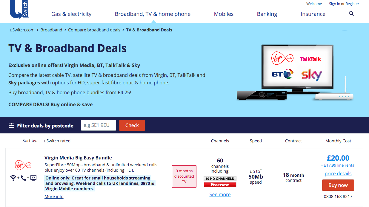
Moving the first two Broadband designs ('Oldest stlye' and 'Old style') to be more ‘in line’ with the third design ('New style') is an on-going project of consistency.
Changing the colours of the first design or moving to a consistent layout would not require testing.
Similarly, changing the row-data presentation in the second example to be more consistent with the third example would not require testing.
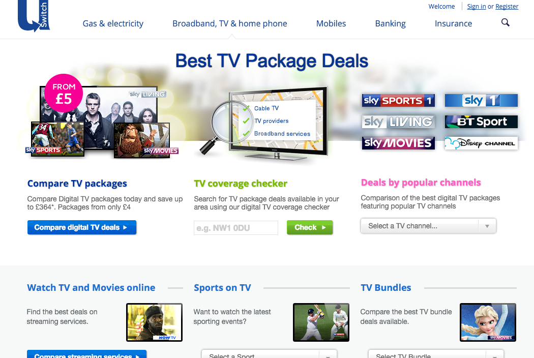 New style
Design conventions
There are certain web-design standards, and in our aim for a consistent user experience, maintaining web consistency is an important part of that.
The following is a non-exhaustive list of design conventions:
- Logos top (left) and links to HP
- Navigation is top of the page
- Text links are blue (pre-click)
- Buttons link to stuff (affordance)
- Icons (search)
- Visual hierarchy
- Search (top right)
- Clickable form fields
Example
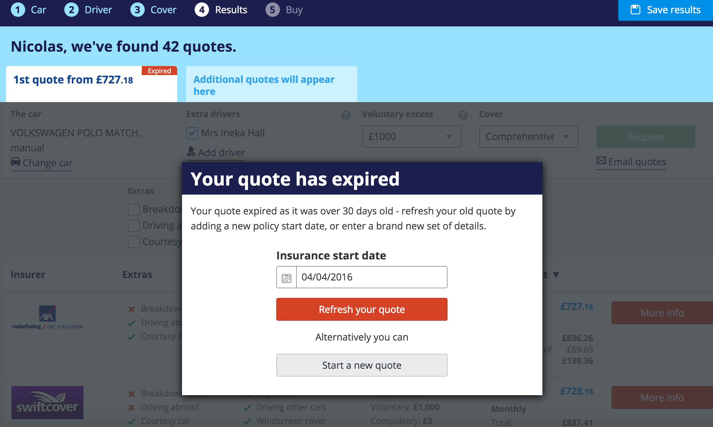
A basic UI convention is the distinction between active elements and inactive elements, with inactive elements being 'greyed out'.
The below car insurance has an overlay that must be interacted with to continue with the page below, but only part of the page is greyed out.
Five clickable elements on this page aren’t greyed out, despite not being clickable:
Usability conventions
The ten basic usability heurisitcs, like basic design rules, give us a number of usability principles that must be sense-checked against. Designs that do not meet these requirements give us a clear problem to be solved without the requirement of validation.
Visibility of system status
Keep users informed about what is going on through appropriate feedback within reasonable time. In the example below the user cannot see what impact selecting a dropdown option has because the overlay covers the results table:
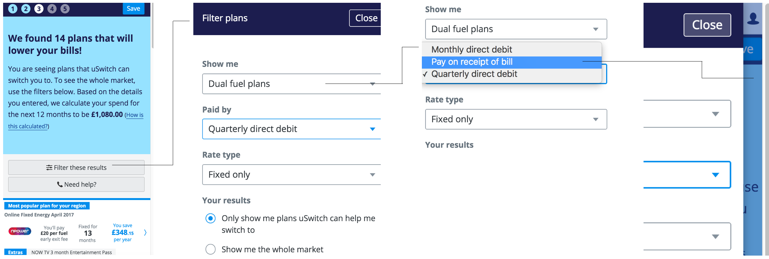
"Did updating those filters do anything?"
Match between system and the real world
Speak the users' language with words, phrases and concepts familiar to the user, rather than system-oriented terms. Follow real-world conventions, making information appear in a natural and logical order.

"Large as in size of people or house? Doesn’t it depend what they’re doing? What’s a Plusnet safeguard?"
User control and freedom
If a user makes a mistake, let them undo, redo, go back, etc...

"I wanted more details...and now i've left the site....how do I get back?”
Consistency and standards
Users should not have to wonder whether different words, situations, or actions mean the same thing.

"Is a plan and a tariff the same thing?”
Error prevention
Even better than good error messages is a careful design which prevents a problem from occurring in the first place.
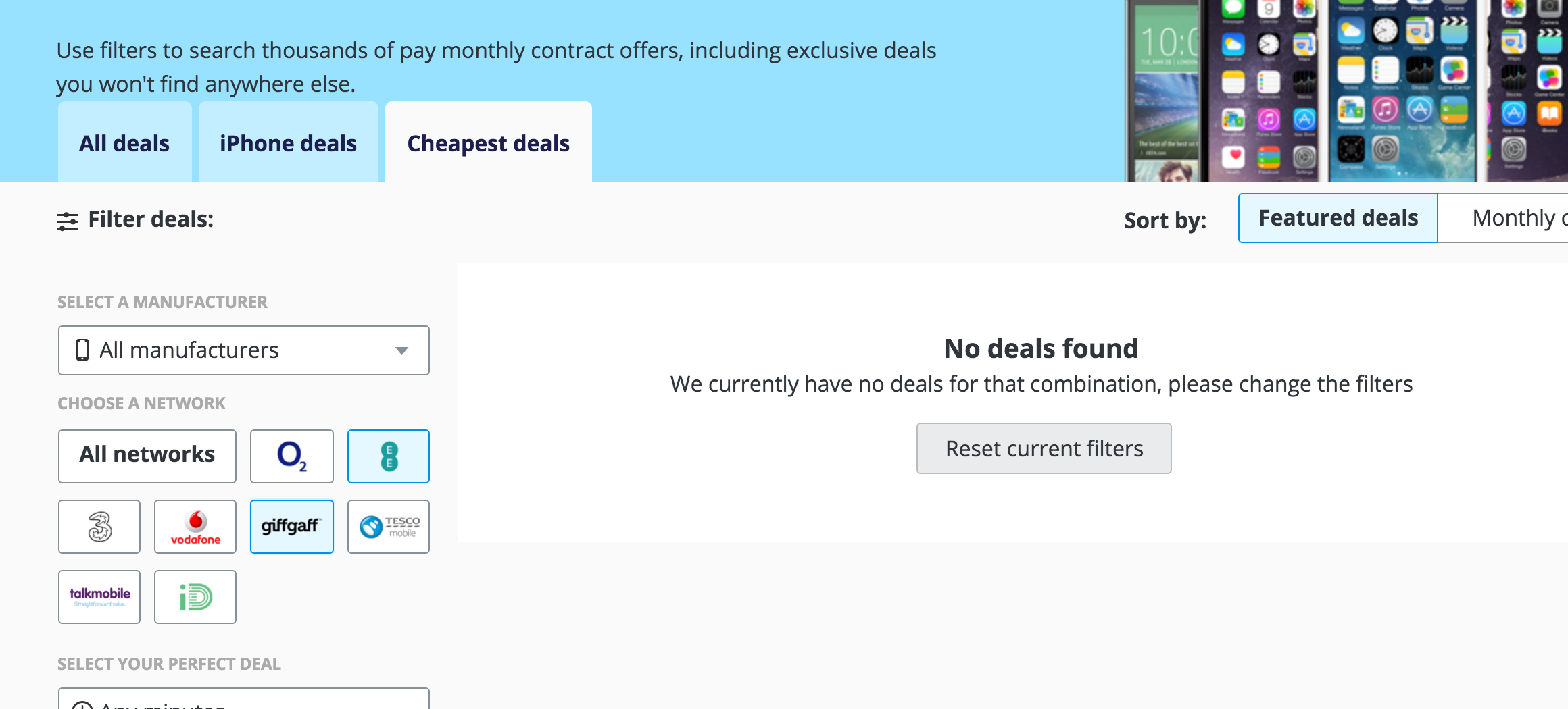
"No deals, why did you present it as an option?"
Recognition rather than recall
Minimise the user's memory load by making objects, actions, and options visible. The user should not have to remember information from one part to another.
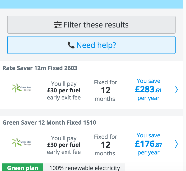
"I’ve filtered these results, but by what?"
Flexibility and efficiency of use
llow users to tailor frequent actions. 1-button checkout via Amazon, or Add to my wishlist via Airbnb.

"I personalised all these details yesterday, why has it just reverted?"
Aesthetic and minimalist design
Every extra unit of information in a dialogue competes with the relevant units of information and diminishes their relative visibility.
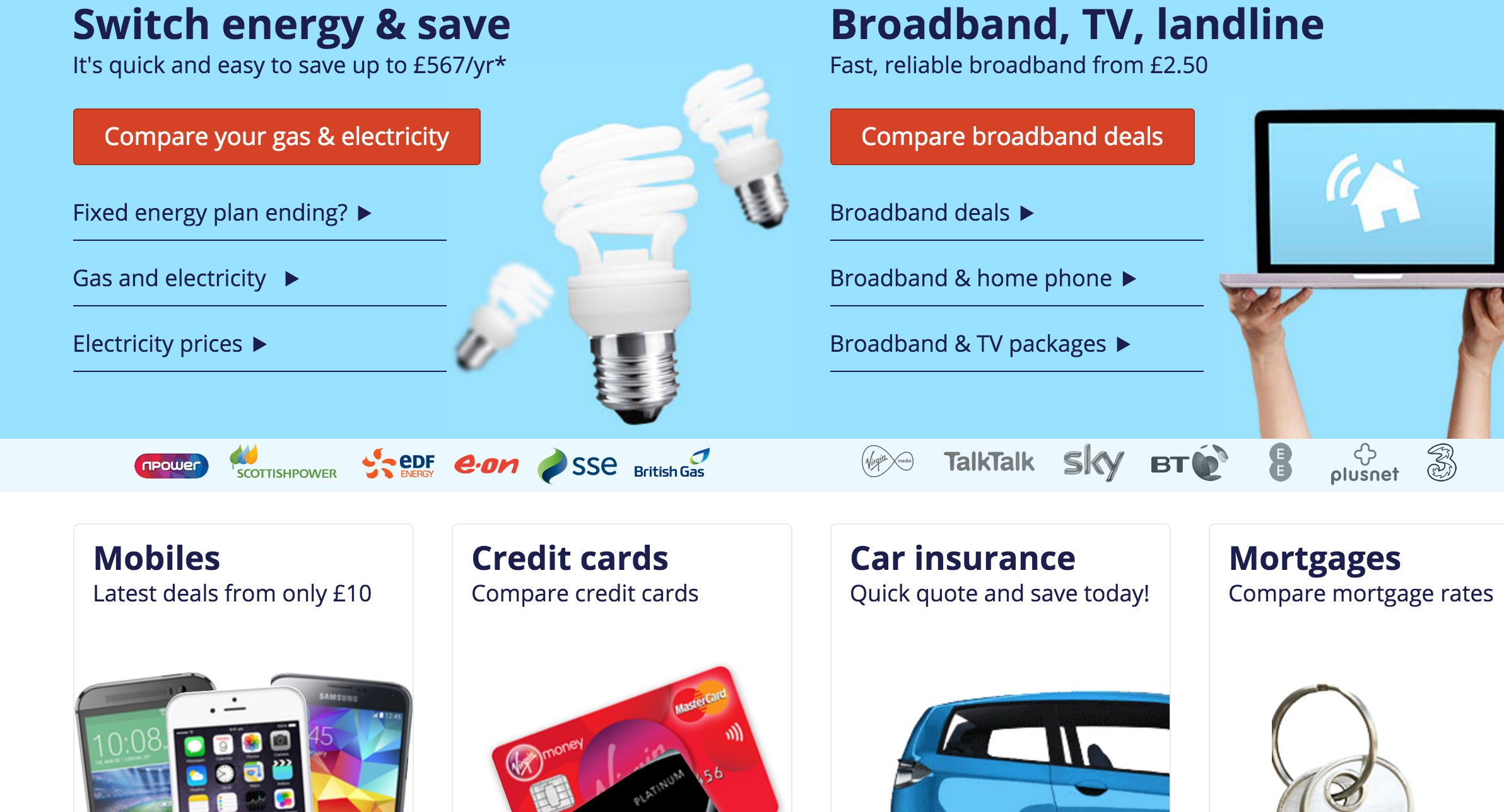
"What am I supposed to do on this page?"
Help users recognise, diagnose, and recover from errors
Error messages should be expressed in plain language, precisely indicate the problem, and constructively suggest a solution.
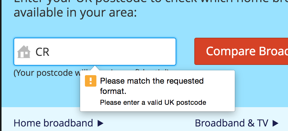
"Ahhhh....the ol' requested format..."
Help and documentation
Any such help information should be easy to find, focused on the user's task, list concrete steps to be carried out, and not be too wordy.
External requirements
Sometimes design is dictated - commercial or regulatory or business.
If there is flexibility around how these are implemented we can enter the design process. Sometimes there isn’t though, and they have to be implemented.
Example
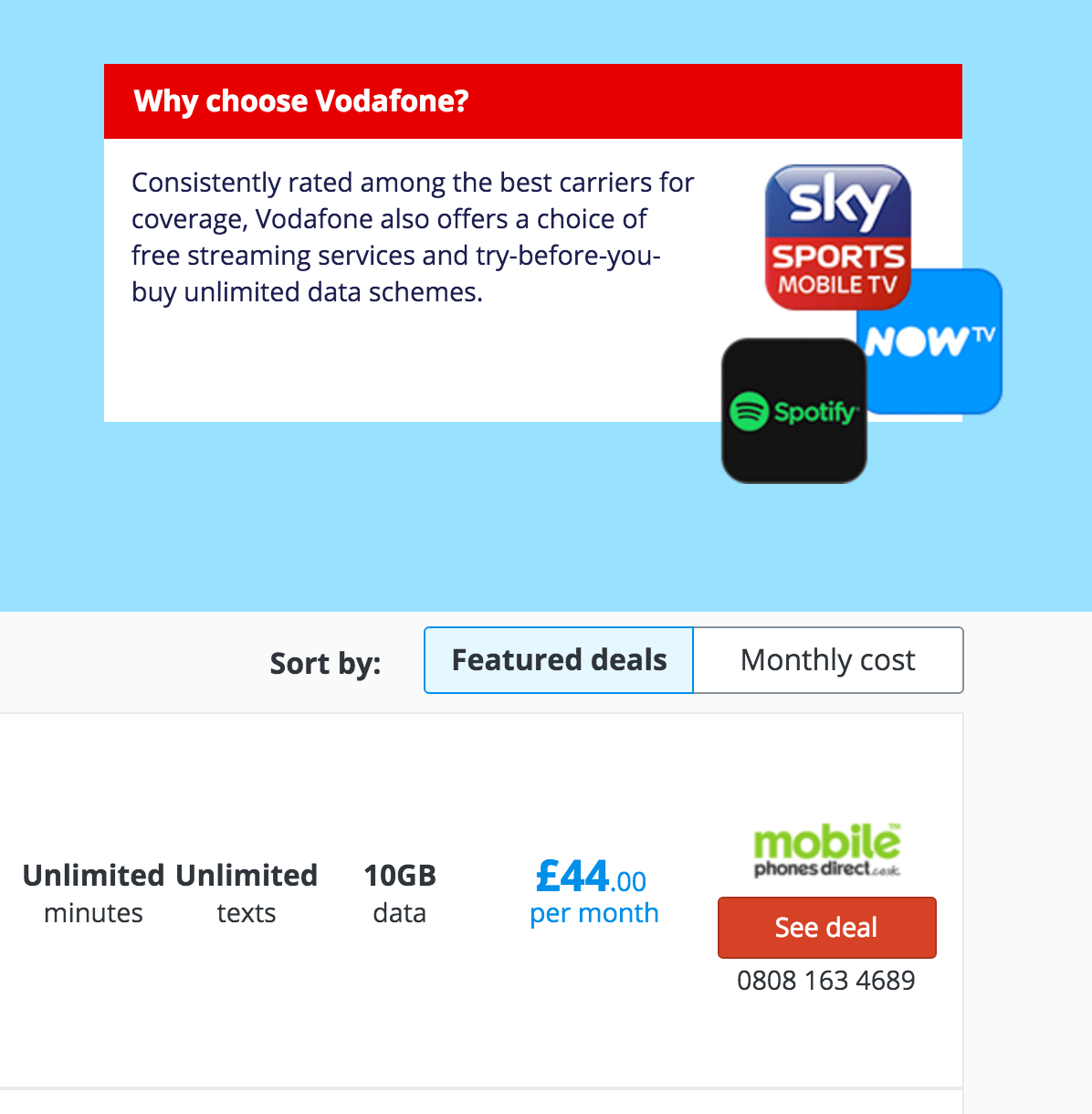
"The brand red clashes with this provider's red."
When do we need validation?
If our change isn’t down to one of the above then it’s problem solving, so we need to structure our approach to design differently - we need to understand the problem first.
Symptoms not problems
A problem statement is the design brief, but first we need a good problem.
Data tells us about results, not causes. It tells us that it looks like there is a problem, but now what the problem is. Data comes from:
- GA
- Fullstory
- Crazyegg
Similarly business objectives are things we desire to happen. They tell us what we want to the outcome to be. Objectives sound like:
- Increase conversion by…
- Reduce drop out by…
- Stop people bouncing on…
- Stop people clicking out on…
- Get people to click on…
These tell us there is a problem, but we don’t know what it is.
A real problems is something we’ve observed a significant number of occasions.
How to define the problem
Testing designed to steer design, or validate assumptions about what problems users are encountering, is known as ‘formative’ testing. It’s open-ended, and the tasks are simply to run a comparison, or to go through a journey start to finish.
Any type of testing, whether it be face-to-face, guerilla, remote, or interviews, can help define the problem. This allows us to frame the problem with a problem statement. A problem statement is:
A concise description of the issues that need to be addressed - it is specific, measurable and explains what it impacts. There are no assumptions or solutions.
Only with a problem can you design a solution
Once the problem is clearly defined, start trying to solve it (one problem at a time), but remember to validate the solutions as soon as possible.
'Summative' usability testing can help validate. Summative testing gives the user a particular task to complete that tests the solution against the problem. Again, any type of testing can perform this function.
But wait!
User testing is great to validate flows, designs and interactions, but it's not exhaustive. There might be bugs, or solutions that don't work in certain scenarios. This is where in-house testing and the device lab comes in.
How to test
So what type of testing should we use, and when?
This article by Nielsen Norman Group is a great starting point to understand testing methods and when to apply each.There are over 20 types of validation, including quant methods, but here at uSwitch we predominantly use the following:
Interviews
Interviews are designed to understand behaviours, needs and pain-points around a particular task.
They are open-ended and can help define design personas - archetypes that can be used as a reference point for any design changes for that product.
How
See the interview checklist
When
Interviews are most commonly used at the earliest stage of product development to determine the needs/problems that the product will address.
Face-to-face usability testing
Face-to-face testing can be used in a formative or summative sense, and can be combined with an interview and simple exercises, like card sorting.
This is the highest-fidelity form of validation. The feedback you receive will be of the highest quality, but it will also take you the most time.
How
Face-to-face testing consists of preparing a particular task, putting it in front of real users, and seeing how they get on.
As it’s face-to-face, you can also interview users in this format, or ask them to complete exercises such as:
- Product Reaction Cards - Used to determine how desirable a product or process is
- Unmarked Semantic Differential Scales - Used to understand reactions to particular words and phrases
- Card sorting - Used to understand hierarchy of importance, or expected flows
See the testing checklist for a step-by-step guide to setting up and running a test. The most crucial components are:
- Goals - What are you trying to achieve?
- Tasks - Every task you ask a user to complete should answer a question you need answered. Formative testing on an exisiting product will have open-ended goals, whereas tasks designed to test a solution should be specific.
- Test plan - Script, scenario, tasks, participants, questions, anything the moderators needs. Write it all down so you have it to hand during the test.
- Test the test - Something will go wrong, promise, so test it first.
- Get your team involved - There's nothing like seeing your solution fail first hand.
When
Anytime. For an existing product where the objective is to discover problems, an open-ended test asking users to complete the most common journey. This should be done at least once a year.
For a new product or feature face-to-face testing is always a good idea. The objective here is to test the solution against the problem using particular tasks.
Guerilla testing
A lower-fidelity version of face-to-face testing, guerilla testing sacrifices quality for speed. The feedback you receive will be of lower quality as the participants may not fit user types, and the testing environment is more ‘ad-hoc’ (think coffee shops, sandwich places).
Just like face-to-face testing, guerilla testing involves preparing a particular task, putting it in front of real users, and seeing how they get on. You can also do interviews and get quant feedback but again, the feedback will be lower quality.
How
See the guerilla testing checklist for a step-by-step guide to setting up and running a test.
The number of participants should be at least 5 for guerilla testing, but you can use your discretion.
When
Guerilla testing is perfect at the early stage of a design, when you want to sense check a particular flow, component, or wording.
Any fidelity of design can be used. Guerilla testing works best when kept relatively informal, and the participant feels at ease.
In-house testing
Asking your colleagues in the office for feedback. This is the quickest but lowest quality form of validation.
Like guerilla testing this is an informal type of testing, but the quality is considerably lower owing to familiarity with the product, bias based on personal relationships and a mismatch between persona types and testers.
In-house testing is perfect for bug testing, seeing if anyone can ‘break’ your design, and last-minute tweaks. It is not for designed to surface flow or interaction changes.
How
See the bug-testing checklist
When
A few days before release