Microcopy
Microcopy
Anything shorter than a paragraph is classified as microcopy. Think anything from tooltips to button text.
Help text/tool tips

Tooltips are an interruption, use them sparingly (or not at all).
Keep the tooltip text concise. Tooltips are perfect for short sentences and sentence fragments; large blocks of text can be overwhelming and should be avoided.
Tooltip text must be informative. Don't make it obvious or just repeat what is already on the screen. Because tooltip text isn't always visible, it should be supplemental info that users don't have to read.
Badge/label/USP

Very short text (1-4 words max) to distinguish products from one another and highlight features of a product that are otherwise not included on the results table. Annotated versions are paired with a descriptive line.
Should be written in sentence case, not upper case. The label should be 1-4 words, while descriptive lines should be as concise as possible without wrapping on any device.
Must be quantifiable facts about a product, deal or plan be honest and as descriptive as possible. No exclamation points.
Product info
Summary of product features relevant to users. Must be concise, relevant and quantifiable facts about a product, deal or plan – be honest and as descriptive as possible
Be consistent in the way and the order information is presented and the types of information shown. Second person is ok (e.g. “More people in your region switched to this plan than any other”)
Small print

Small print reassures users and is vital for transparency.
As long as any compliance rules are taken into account, you should treat this copy like any other, and have a responsibility to make this text as comprehensible as possible to a user
Caveats

Small print text to back up any absolute claims (i.e. savings figures), denoted with an asterisk, followed by an anchor and double-anchor for further caveats. The caveat must appear on the same page as the symbol.
- For the first caveat on a page use *
- For the second use †
- And for the third, use ‡
Examples of when caveats are required...
- Get the best iPhone deal with uSwitch*
- Get the cheapest iPhone deal with uSwitch†
And when they're not required...
- Find a better energy deal
- How to find the best iphone deal
Button text
Very short (1-3 words) actionable description of what happens when the button clicked, namely, what's on the next page.
Button text should “keep its promise” and properly set up expectations of what comes next
It should be concise (1-3 words), should not contain exclamation points, should feel actionable (e.g. “buy” “switch” “get” “apply” “compare”), and can make use of urgency (e.g. “today” “now”)
First person can be used (e.g. “Tell me more”).
CTAs

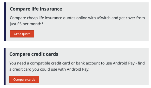
An introduction to button text, usually one to two lines, that provides a reason to click the accompanying button
This is only used on editorial pages. Sentence case should be used, no exclamation points, and the text must relate to the button and its action. A CTA should not end with punctuation (unlike a standard paragraph).
Should not be more than two lines, usually made up of a title and copy.
Form text, form labels
Description of what information is required from the user. Always aim for clarity and be consistent – if using questions ('Where do you live?') or statements ('Address')
Second person is acceptable, and use tool tips to explain any terms that may be unfamiliar
Form label naming conventions:
- First name
- Last name
- Date of birth
- Password
- Postcode
- Address
- Main account holder’s name
- Driver’s name
- Employment status
- Annual income (before tax)
Placeholder text for fields
Pre-populated text in a field that is supposed to serve as an example or a necessary instruction.
We only use placeholder text for instructions, as a last resort, when we have no space for labels, or for email/password.
Symbols can be used (e.g. £ ) and we use sentence case. Our standard placeholder text is:
- Please select
- Enter postcode
- DD/MM/YYYY
- Email address
- Password
Error text

Text that is triggered by a user trying to move forward without providing requested info.
Error text should be as specific and as useful/helpful as possible, but should also be short; sentence fragments are acceptable.
Never be alarming, technical, or condescending (in life, but especially when it comes to error text)
H1
Short description of the page, at a glance.
This text should be genuinely helpful, in sentence case, and should be kept as short as possible.
Introductory text
A short (two lines at most) introduction that follows on from the H1. Describes the following content and encourages the user to read on, and provides as much relevant information as possible.
This text should be genuinely helpful, sentence case, and should tell the user whether they are in the right place.